
pizza rebrand
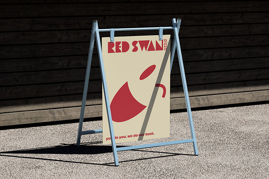
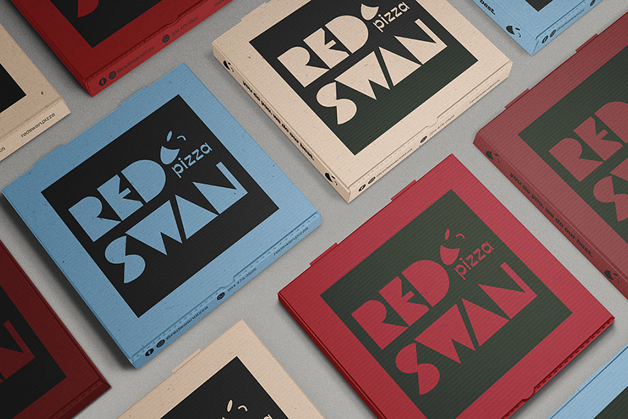
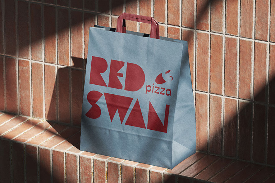
this project changes the visual identity of Red Swan Pizza with the goal of making the brand more appealing to a younger audience. the typography connects with shapes from the shapes found inside a pizza box: the circle of the pizza, the triangle of a slice, the rectangle of the box itself. these geometric forms become the building blocks of each letter, giving the wordmark a constructed, modular quality that feels both playful and intentional. the accompanying element reads as an angled, smiling face. it adds warmth and personality to the identity. the colour palette pairs a deep, muted red with a soft, dusty blue, stepping away from the conventions of typical pizza branding in favour of something more contemporary. the tagline, "you do you. we do our best," reinforces the brand's relaxed, approachable tone. together, these elements form a cohesive identity that feels fresh, confident, and tailored to a new generation of customers.
let's keep in touch?


